CSSで実装するふきだしのデザインまとめ
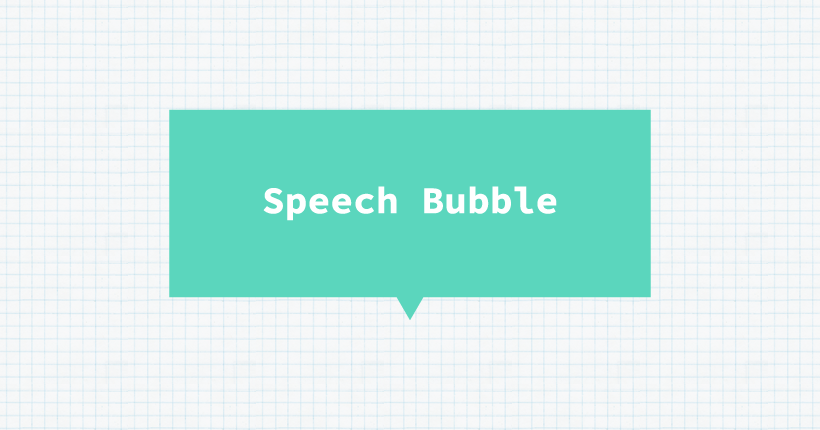
HTMLとCSSだけで作るシンプルなふきだしのコードと、デザインサンプルをまとめました。
ふきだしの作り方
ベースとなるシンプルな四角いふきだしの作り方です。
SAMPLE TEXT
<div class="balloon">
  SAMPLE TEXT
</div>上記がサンプルのHTMLコードです。ふきだしにするテキストを「balloon」クラスのついたdivタグで囲みます。
.balloon {
  display: inline-block;
  font-weight: bold;
  color: #fff;
  background: #333;
  padding: 20px 22px;
  position: relative;
}
.balloon::before {
  content: "";
  position: absolute;
  width: 15px;
  height: 12px;
  background: #333;
  bottom: -12px;
  left: 0;
  right: 0;
  clip-path: polygon(0 0, 100% 0, 50% 100%);
  margin: auto;
}テキストの入る部分に疑似要素beforeで作成した三角形をつけて「ふきだし」の形にしています。
「balloon」クラスでふきだしのテキスト部分のフォントや余白を設定しています。
ふきだしのしっぽの部分はclip-pathで作成した三角形を、potisionで配置してします。margin: auto;を設定した状態でleft: 0;、right: 0;を設定するとしっぽ部分がふきだしの中央に配置されます。
clip-pathの形と位置を変えるとふきだしの向きを変更できます。
上向き
SAMPLE TEXT
.balloon {
  display: inline-block;
  font-weight: bold;
  color: #fff;
  background: #333;
  padding: 20px 22px;
  position: relative;
}
.balloon::before {
  content: "";
  position: absolute;
  width: 15px;
  height: 12px;
  background: #333;
  top: -12px;
  left: 0;
  right: 0;
  clip-path: polygon(50% 0, 100% 100%, 0 100%);
  margin: auto;
}
左向き
SAMPLE TEXT
.balloon {
  display: inline-block;
  font-weight: bold;
  color: #fff;
  background: #333;
  padding: 20px 22px;
  position: relative;
}
.balloon::before {
  content: "";
  position: absolute;
  width: 12px;
  height: 15px;
  background: #333;
  top: 0;
  bottom: 0;
  left: -12px;
  clip-path: polygon(0 50%, 100% 0, 100% 100%);
  margin: auto;
}
右向き
SAMPLE TEXT
.balloon {
  display: inline-block;
  font-weight: bold;
  color: #fff;
  background: #333;
  padding: 20px 22px;
  position: relative;
}
.balloon::before {
  content: "";
  position: absolute;
  width: 12px;
  height: 15px;
  background: #333;
  top: 0;
  bottom: 0;
  right: -12px;
  clip-path: polygon(0 0, 100% 50%, 0 100%);
  margin: auto;
}
角丸のふきだし
テキストを囲む部分にborder-radiusを設定すると、角丸のふきだしになります。
SAMPLE TEXT
.balloon {
  display: inline-block;
  font-weight: bold;
  color: #fff;
  background: #333;
  border-radius: 12px;
  padding: 20px 22px;
  position: relative;
}
.balloon::before {
  content: "";
  position: absolute;
  width: 15px;
  height: 12px;
  background: #333;
  bottom: -12px;
  left: 0;
  right: 0;
  clip-path: polygon(0 0, 100% 0, 50% 100%);
  margin: auto;
}
枠線のふきだし
枠線のついたふきだしはテキスト部分にはborderで線をつけ、しっぽの部分は2つの三角形をずらして作成しています。
SAMPLE TEXT
.balloon {
  display: inline-block;
  font-weight: bold;
  color: #333;
  background: #fff;
  border: solid 3px #333;
  padding: 20px 22px;
  position: relative;
}
.balloon::before {
  content: "";
  position: absolute;
  width: 18px;
  height: 15px;
  background: #fff;
  bottom: -10px;
  left: 0;
  right: 0;
  clip-path: polygon(0 0, 100% 0, 50% 100%);
  z-index: 1;
  margin: auto;
}
.balloon::after {
  content: "";
  position: absolute;
  width: 18px;
  height: 15px;
  background: #333;
  bottom: -15px;
  left: 0;
  right: 0;
  clip-path: polygon(0 0, 100% 0, 50% 100%);
  margin: auto;
}疑似要素afterで作成したしっぽ部分の三角形に、疑似要素beforeで作成した背景と同じ色の三角形をずらして重ねることで枠線のしっぽ部分を作成しています。
角丸にアレンジ
border-radiusを設定すると、角丸のふきだしになります。
SAMPLE TEXT
.balloon {
  display: inline-block;
  font-weight: bold;
  color: #333;
  background: #fff;
  border: solid 3px #333;
  border-radius: 12px;
  padding: 20px 22px;
  position: relative;
}
.balloon::before {
  content: "";
  position: absolute;
  width: 18px;
  height: 15px;
  background: #fff;
  bottom: -10px;
  left: 0;
  right: 0;
  clip-path: polygon(0 0, 100% 0, 50% 100%);
  z-index: 1;
  margin: auto;
}
.balloon::after {
  content: "";
  position: absolute;
  width: 18px;
  height: 15px;
  background: #333;
  bottom: -15px;
  left: 0;
  right: 0;
  clip-path: polygon(0 0, 100% 0, 50% 100%);
  margin: auto;
}
下線だけのアレンジ
枠線を下線だけに変更すると、テキストを囲まないふきだしになります。
SAMPLE TEXT
.balloon {
  display: inline-block;
  font-weight: bold;
  color: #333;
  background: #fff;
  border-bottom: solid 3px #333;
  padding: 20px 22px;
  position: relative;
}
.balloon::before {
  content: "";
  position: absolute;
  width: 18px;
  height: 15px;
  background: #fff;
  bottom: -10px;
  left: 0;
  right: 0;
  clip-path: polygon(0 0, 100% 0, 50% 100%);
  z-index: 1;
  margin: auto;
}
.balloon::after {
  content: "";
  position: absolute;
  width: 18px;
  height: 15px;
  background: #333;
  bottom: -15px;
  left: 0;
  right: 0;
  clip-path: polygon(0 0, 100% 0, 50% 100%);
  margin: auto;
}テキストを囲むborderをborder-bottomに変更しています。しっぽ部分を作成する都合上、透過背景にならないので、実際にふきだしを配置するデザインの背景色に合わせて設定します。
線のふきだし
直線の組み合わせで作成するふきだしです。
SAMPLE TEXT
.balloon {
  display: inline-block;
  font-weight: bold;
  color: #333;
  background: #fff;
  border: solid 3px #333;
  padding: 20px 22px;
  position: relative;
}
.balloon::before {
  content: "";
  position: absolute;
  width: 3px;
  height: 24px;
  background: #333;
  bottom: -18px;
  left: 0;
  right: 0;
  margin: auto;
  z-index: 2;
}
.balloon::after {
  content: "";
  position: absolute;
  width: 15px;
  height: 7px;
  background: #fff;
  bottom: -3px;
  left: 0;
  right: 0;
  margin: auto;
  z-index: 1;
}疑似要素afterでふきだしの背景色と同じ線を重ねて隙間を作成し、疑似要素beforeでしっぽ部分の直線を引いています。
疑似要素afterのwidthが隙間の幅になります。疑似要素beforeのwidthがしっぽの直線の幅、heightが長さになります。
下線だけのアレンジ
枠線を下線だけに変更すると、テキストを囲まない直線を組み合わせたデザインのふきだしになります。
SAMPLE TEXT
.balloon {
  display: inline-block;
  font-weight: bold;
  color: #333;
  background: #fff;
  border-bottom: solid 3px #333;
  padding: 20px 22px;
  position: relative;
}
.balloon::before {
  content: "";
  position: absolute;
  width: 3px;
  height: 24px;
  background: #333;
  bottom: -18px;
  left: 0;
  right: 0;
  margin: auto;
  z-index: 2;
}
.balloon::after {
  content: "";
  position: absolute;
  width: 15px;
  height: 7px;
  background: #fff;
  bottom: -3px;
  left: 0;
  right: 0;
  margin: auto;
  z-index: 1;
}
斜め線のふきだし
枠線に隙間を開けて、斜めの直線を加えたデザインのふきだしです。
SAMPLE TEXT
.balloon {
  display: inline-block;
  font-weight: bold;
  color: #333;
  background: #fff;
  border: solid 3px #333;
  padding: 20px 22px;
  position: relative;
}
.balloon::before {
  content: "";
  position: absolute;
  width: 15px;
  height: 18px;
  background: #fff;
  bottom: -18px;
  left: 10%;
  border-right: 3px solid #333;
  transform: skew(-30deg);
  z-index: 1;
}疑似要素beforeで枠線の隙間と、斜めの直線を作成しています。transform: skew(-30deg);が直線の角度です。しっぽ部分の位置はleft: 10%;で設定していますが、数値で固定することも可能です。
下線だけのアレンジ
枠線を下線だけに変更すると、直線と斜め線で構成されたデザインのふきだしになります。
SAMPLE TEXT
.balloon {
  display: inline-block;
  font-weight: bold;
  color: #333;
  background: #fff;
  border-bottom: solid 3px #333;
  padding: 20px 22px;
  position: relative;
}
.balloon::before {
  content: "";
  position: absolute;
  width: 15px;
  height: 18px;
  background: #fff;
  bottom: -18px;
  left: calc(50% - 12px);
  border-right: 3px solid #333;
  transform: skew(-30deg);
  z-index: 1;
}しっぽの部分はleft: calc(50% - 12px);で中央に配置しています。
丸いふきだし
テキストの部分を円形にした、丸いフォルムのふきだしです。
SAMPLE
.balloon {
  display: inline-block;
  width: 120px;
  height: 120px;
  font-weight: bold;
  text-align: center;
  line-height: 120px;
  color: #fff;
  background: #333;
  border-radius: 50%;
  position: relative;
}
.balloon::before {
  content: "";
  position: absolute;
  width: 15px;
  height: 12px;
  background: #333;
  bottom: -10px;
  left: 0;
  right: 0;
  clip-path: polygon(0 0, 100% 0, 50% 100%);
  margin: auto;
}テキスト部分をwidthとheightで正方形にしてからborder-radius: 50%;で正円にしています。
ふきだし内のテキストに、円の直径と同じ高さをline-heightに設定して文字が中央に来るように設定しています。
テキスト部分がカーブしてるので、しっぽの部分を四角形のふきだしより若干上に移動しています。
角度の変更
しっぽ部分の角度と表示位置を変更すると斜め向きのふきだしになります。
SAMPLE
.balloon {
  display: inline-block;
  width: 120px;
  height: 120px;
  font-weight: bold;
  text-align: center;
  line-height: 120px;
  color: #fff;
  background: #333;
  border-radius: 50%;
  position: relative;
}
.balloon::before {
  content: "";
  position: absolute;
  width: 15px;
  height: 12px;
  background: #333;
  bottom: 10px;
  left: 90px;
  right: 0;
  clip-path: polygon(0 0, 100% 0, 50% 100%);
  transform: rotate(-45deg);
  margin: auto;
}
枠線のアレンジ
四角形と同様に疑似要素を二つ重ねて、枠線のふきだしにアレンジできます。
SAMPLE
.balloon {
  display: inline-block;
  width: 120px;
  height: 120px;
  font-weight: bold;
  text-align: center;
  line-height: 120px;
  color: #333;
  background: #fff;
  border: solid 3px #333;
  border-radius: 50%;
  position: relative;
}
.balloon::before {
  content: "";
  position: absolute;
  width: 18px;
  height: 15px;
  background: #fff;
  bottom: -10px;
  left: 0;
  right: 0;
  clip-path: polygon(0 0, 100% 0, 50% 100%);
  margin: auto;
  z-index: 1;
}
.balloon::after {
  content: "";
  position: absolute;
  width: 18px;
  height: 15px;
  background: #333;
  bottom: -15px;
  left: 0;
  right: 0;
  clip-path: polygon(0 0, 100% 0, 50% 100%);
  margin: auto;
}
しずく形のフキダシ
角丸を利用したシンプルなデザインのふきだしです。
SAMPLE
.balloon {
  display: inline-block;
  width: 120px;
  height: 120px;
  font-weight: bold;
  text-align: center;
  line-height: 120px;
  color: #fff;
  background: #333;
  border-radius: 50% 50% 0 50%;
}ふきだし内のテキストに、円の直径と同じ高さをline-heightに設定して文字がふきだしの中央に配置されるように設定しています。
border-radiusだけでふきだしの形を作成しているので、擬似要素は使わないシンプルなコードで作成できます。
枠線のアレンジ
線を設定すればの枠線のタイプのふきだしになります。
SAMPLE
.balloon {
  display: inline-block;
  width: 120px;
  height: 120px;
  font-weight: bold;
  text-align: center;
  line-height: 120px;
  color: #333;
  background: #fff;
  border: solid 3px #333;
  border-radius: 50% 50% 0 50%;
}
影のついたふきだし
ふきだしを2つ重ねた、影付きデザインのふきだしです。
SAMPLE TEXT
HTMLに影の部分を実装するためのspanを追加します。
<div class="balloon">
  SAMPLE TEXT<span class="behind"></span>
</div>
.balloon {
display: inline-block;
font-weight: bold;
color: #fff;
background: #333;
border-radius: 12px;
padding: 20px 22px;
position: relative;
}
.balloon::before {
content: "";
position: absolute;
width: 15px;
height: 12px;
background: #333;
bottom: -12px;
left: 0;
right: 0;
clip-path: polygon(0 0, 100% 0, 50% 100%);
margin: auto;
}
.balloon::after {
content: "";
position: absolute;
width: 15px;
height: 12px;
background: #c8c8c8;
bottom: -11px;
left: 0;
right: 0;
clip-path: polygon(0 0, 100% 0, 50% 100%);
transform: translateX(6px) translateY(5px);
z-index: -1;
margin: auto;
}
.balloon .behind {
background: #c8c8c8;
border-radius: 12px;
width: 100%;
height: 100%;
position: absolute;
top: 0;
left: 0;
z-index: -1;
transform: translateX(6px) translateY(5px);
}陰になるふきだしを「behind」クラスのついたspanで作成しています。しっぽ部分の影は、擬似要素afterで作成して、ふきだし全体をtransformで右下に移動しています。
枠と影のついたふきだし
枠線付きのふきだしにシャドウをつけた、立体感のあるふきだしです。
SAMPLE TEXT
HTMLに影の部分を実装するためのspanを追加します。
<div class="balloon">
  SAMPLE TEXT<span class="behind"></span>
</div>
.balloon {
display: inline-block;
font-weight: bold;
color: #333;
background: #5bd4c4;
border: solid 3px #333;
padding: 20px 22px;
position: relative;
}
.balloon::before {
content: "";
position: absolute;
bottom: -10px;
left: 0;
right: 0;
width: 18px;
height: 15px;
background: #5bd4c4;
clip-path: polygon(0 0, 100% 0, 50% 100%);
z-index: 1;
margin: auto;
}
.balloon::after {
content: "";
position: absolute;
bottom: -18px;
left: 0;
right: -3px;
width: 18px;
height: 15px;
background: #333;
clip-path: polygon(0 0, 100% 0, 50% 100%);
margin: auto;
}
.balloon .behind {
background: #333;
width: 100%;
height: 100%;
position: absolute;
top: 0;
left: 0;
z-index: -1;
transform: translateX(6px) translateY(5px);
}
立体の影の部分は「behind」クラスをつけたspanで作成しています。しっぽ部分の影は、擬似要素afterで作成して、positionで配置位置を調整しています。
余白と背景のふきだし
一回り小さいオフセットの背景がついたデザインのふきだしです。
SAMPLE TEXT
.balloon {
  display: inline-block;
  font-weight: bold;
  color: #333;
  background: #fff;
  border: solid 3px #333;
  padding: 20px 22px;
  position: relative;
}
.balloon::before {
  content: "";
  position: absolute;
  width: 15px;
  height: 18px;
  background: #fff;
  bottom: -18px;
  left: 0;
  right: 7px;
  border-right: 3px solid #333;
  margin: auto;
  z-index: 1;
}
.balloon::after {
  content: "";
  position: absolute;
  width: calc(100% - 12px);
  height: calc(100% - 12px);
  background: #5bd4c4;
  top: 6px;
  left: 6px;
  mix-blend-mode: multiply;
}背景は擬似要素afterの幅と高さにそれぞれcalc(100% - 12px)を設定して全体から「12px」小さいサイズにしています。
ずらした背景のふきだし
背景を右下にずらしたデザインのふきだしです。
SAMPLE TEXT
.balloon {
  display: inline-block;
  font-weight: bold;
  color: #333;
  background: #fff;
  border: solid 3px #333;
  padding: 20px 22px;
  position: relative;
}
.balloon::before {
  content: "";
  position: absolute;
  width: 15px;
  height: 18px;
  background: #fff;
  bottom: -18px;
  left: 0;
  right: 7px;
  border-right: 3px solid #333;
  transform: skew(-30deg);
  margin: auto;
  z-index: 1;
}
.balloon::after {
  content: "";
  position: absolute;
  width: 100%;
  height: 100%;
  background: #5bd4c4;
  top: 8px;
  left: 8px;
  mix-blend-mode: multiply;
  z-index: 2;
}枠線のふきだしに擬似要素afterで背景を追加しています。mix-blend-mode: multiply;で、背景をテキストに重ねています。
丸いふきだしでも同様に実装できます。
SAMPLE
しっぽ部分に擬似要素を2つ使用するため、背景部分は「behind」クラスをつけたspanで実装します。
<div class="balloon">
  SAMPLE<span class="behind"></span>
</div>
.balloon {
display: inline-block;
width: 120px;
height: 120px;
font-weight: bold;
text-align: center;
line-height: 120px;
color: #333;
background: #fff;
border: solid 3px #333;
border-radius: 50%;
position: relative;
}
.balloon::before {
content: "";
position: absolute;
width: 3px;
height: 24px;
background: #333;
bottom: -18px;
left: 0;
right: 0;
margin: auto;
z-index: 2;
}
.balloon::after {
content: "";
position: absolute;
width: 15px;
height: 7px;
background: #fff;
bottom: -3px;
left: 0;
right: 0;
margin: auto;
}
.balloon .behind {
background: #5bd4c4;
border-radius: 50%;
width: 100%;
height: 100%;
position: absolute;
top: 7px;
left: 7px;
mix-blend-mode: multiply;
z-index: 2;
}