WordPressにSwiperでスライダーを実装する方法

Swiperを使って、WordPressサイトにスライダーを実装する手順の備忘録です。
Swiperは、スライダーを簡単に作成することができるJavaScriptのプラグインです。
jQuery非依存なので、jQueryを使用せずに実装することができます。オプションの設定も豊富で、柔軟なカスタマイズが可能です。
Swiperのインストール
Swiperを導入するために、まずは必要なファイルをインストールします。
インストールは、以下の3つの方法があります。
- CDNを利用する
- ファイルをダウンロードする
- NPMでインストールする
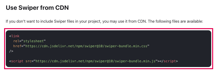
CDNを利用する方法
CDNを利用してファイルを読み込む方法です。
下記のコードを、HTMLコードの該当箇所に記入します。
<link
  rel="stylesheet"
  href="https://cdn.jsdelivr.net/npm/swiper@10/swiper-bundle.min.css"
/>

<script src="https://cdn.jsdelivr.net/npm/swiper@10/swiper-bundle.min.js"></script>CSSを読み込むlinkは「header.php」の<head>タグ内に記入します。
<!DOCTYPE html>
<html lang="ja">
  <head>
    <title>Swiper SAMPLE</title>
    <link rel="stylesheet" href="https://cdn.jsdelivr.net/npm/swiper@10/swiper-bundle.min.css" />
</head>JSを読み込むscriptは「footer.php」の</body>タグの直前に記入します。
    …
    <script src="https://cdn.jsdelivr.net/npm/swiper@10/swiper-bundle.min.js"></script>
  </body>
</html>最新のコードは「Use Swiper from CDN」から確認できます。
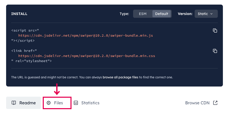
ファイルをダウンロードする方法
ダウンロードしたSwiperのファイルを使用する方法です。
「 Download assets」に記載されているページから、CSSとJSファイルをダウンロードします。

インストール用のコードの下にある、「Files」をクリックします。
「swiper-bundle.min.js」をクリックすると、コードが表示されるのでコピーして保存します。
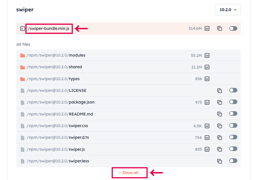
同様に「Show all」をクリックしてCSSファイルをインストールします。
CSSは、「swiper-bundle.min.css」を読み込めば、基本的なスタイルの設定されたスライダーを表示することができます。
自分自身でデザインをカスタマイズしたい場合は、装飾のない「swiper.min.css」を使用します。
今回は「swiper-bundle.min.css」を使用してサンプルを実装します。
保存したCSSとJSファイルを「function.php」にコードを記入して読み込みます。
function add_swiper_files() {
  //CSS
  wp_enqueue_style('swiper-style', get_template_directory_uri() . '/assets/swiper/swiper-bundle.min.css', array(), '1.0.0');
  wp_enqueue_style('swiper-css-style', get_template_directory_uri() . '/css/slider.css', array('swiper-style'), '1.0.0');
  //js
  wp_enqueue_script( 'swiper-script', get_template_directory_uri() . '/assets/swiper/swiper-bundle.min.js', array(), '1.0.0', true);
  wp_enqueue_script( 'swiper-js-script', get_template_directory_uri() . '/js/swiper.js', array('swiper-script'), '1.0.0', true);
}
add_action( 'wp_enqueue_scripts', 'add_swiper_files' );「slider.css」を読み込むコードでは、先に「swiper-bundle.min.css」を読み込むようにarray()に「swiper-style」を設定しています。「slider.css」は、独自にデザインを調整する新規CSSファイルです。
スライダーの表示設定をするための新規ファイル「swiper.js」も一緒に読み込みます。JSファイルは、footerで読み込むために一番最後の値に「true」を設定しています。
ディレクトリのパスは、各自の環境に適したコードに変更してください。
NPMでインストールする方法
NPMからSwiperをインストールする方法です。
$ npm install swiper詳細は、公式サイトGet Startedで確認できます。
HTMLでスライダー要素を作成する
テンプレート内にスライダーを実装するためのクラスを指定したHTMLコードを記入します。
<!-- Slider main container -->
<div class="swiper">
  <!-- Additional required wrapper -->
  <div class="swiper-wrapper">
    <!-- Slides -->
    <div class="swiper-slide">Slide 1</div>
    <div class="swiper-slide">Slide 2</div>
    <div class="swiper-slide">Slide 3</div>
    ...
  </div>
  <!-- If we need pagination -->
  <div class="swiper-pagination"></div>

  <!-- If we need navigation buttons -->
  <div class="swiper-button-prev"></div>
  <div class="swiper-button-next"></div>
</div>
「swiper」「swiper-wrapper」「swiper-slide」の3つは、スライダーを実装するために必須の要素です。
「swiper-wrapper」のdivタグの中に、「swiper-slide」クラスをつけた各スライドを配置しています。
続いて、スライダーを表示するためのスクリプトを追加します。
下記のコードを「swiper.js」に記入します。
jQuery(function(){
  const mySwiper = new Swiper('.swiper', {
    // Optional parameters
    autoplay: true,
    loop: true,

    // If we need pagination
    pagination: {
      el: '.swiper-pagination',
    },

    // Navigation arrows
    navigation: {
      nextEl: '.swiper-button-next',
      prevEl: '.swiper-button-prev',
    }
  });
});
スライダーを自動再生し、ループさせるオプションと、ページネーション、左右の切り替え矢印を設定しています。
JSが読み込まれると、スライダーが表示されます。
そのままでは、表示が崩れてしまうので、サンプルでは下記のようなCSSを「slider.css」に記入しています。
.swiper {
  width: 100%;
  height: 300px;
}

.swiper-slide {
  width: 100%;
  height: 100%;
  display: flex;
  justify-content: center;
  align-items: center;
  font-size: 40px;
  font-weight: bold;
  background-color: #e0ebf0;
}
スライダーのカスタマイズ
スライダーをカスタマイズして、画像をスライドするスライダーを作成します。


レイアウトの変更
まずは、上記のサンプルでスライド部分に重なって表示されているページネーションとナビゲーション(左右の矢印)の配置を変更します。
<div class="slider-area">
  <div class="swiper">
    <div class="swiper-wrapper">
      <div class="swiper-slide"><img src="sample01.png"></div>
      <div class="swiper-slide"><img src="sample02.png"></div>
      <div class="swiper-slide"><img src="sample03.png"></div>
      <div class="swiper-slide"><img src="sample04.png"></div>
    </div>
  </div>
  <div class="swiper-pagination"></div>
  <div class="swiper-button-prev"></div>
  <div class="swiper-button-next"></div>
</div>
各パーツは、HTMLコードを修正するだけでスライドの外に配置する事ができます。
「swiper-pagination」と「swiper-button-prev」「swiper-button-next」を「swiper」のdivタグの外に移動しています。
CSSでは、ページネーションを表示するための下の余白と、ナビゲーションを表示するための左右の余白を調整しています。
.slider-area {
  position: relative;
}
.slider-area .swiper {
  width: 80%;
  height: 300px;
  margin-bottom: 80px;
}
スライド全体を囲む「slider-area」クラスには、各パーツの配置を制御するための「position: relative;」を設定しておきます。
ページネーションのカスタマイズ
ページネーションは、「swiper-pagination」クラスでスタイルを変更できます。
.swiper-pagination {
  bottom: -40px;
}
サンプルでは、表示位置を下げて、スライドに重ならないようにしています。
また、ページネーションのボタン部分は「swiper-pagination-bullet」で、デザインの変更が可能です。
.swiper-pagination-bullet {
  border-radius: 0;
  width: 20px;
  height: 3px;
  transition: .3s;
}
.swiper-pagination-bullet-active {
  background: #5bd4c4;
  width: 36px;
}
「swiper-pagination-bullet-active」クラスは、現在表示中のスライドを表すボタンに適用されます。
ナビゲーションのカスタマイズ
ナビゲーションは、左側の戻るボタンが「swiper-button-prev」クラス、右側の進むボタンが「swiper-button-next」クラスで変更できます。
.swiper-button-prev,
.swiper-button-next {
  position: absolute;
  z-index: 1;
  top: 0;
  bottom: 0;
  margin: auto;
}
.swiper-button-prev {
  left: 0;
}
.swiper-button-next {
  right: 0;
}
.swiper-button-prev:after,
.swiper-button-next:after {
  color: #cecece;
}
矢印のアイコン部分は、デフォルトでは擬似要素「after」でスタイルが設定されています。
Swiperのオプション
上記のサンプルで使用しているオプションと、よく使用されるスライダーの設定です。
自動再生
スライドを自動再生するオプションです。
const mySwiper = new Swiper('.swiper', {
  autoplay: true,
});
「autoplay: true」で、スライドが自動で切り替わるようになります。
スライドの繰り返し
スライドをループ再生するオプションです。
const mySwiper = new Swiper('.swiper', {
  loop: true,
});
「loop: true」で、一番最後のスライドの次に一番最初のスライドが表示されるようになります。
エフェクト
スライドを切り替える時のアニメーションを変更できます。
const mySwiper = new Swiper('.swiper', {
  effect: 'fade',
  fadeEffect: {
    crossFade: true,
  },
});
デフォルトでは「effect: ‘slide’,」が設定され、スライドで切り替わりますが「effect: ‘fade’,」を設定するとフェードで画像が切り替わります。
フェードでは、スライドが重なるように配置されているため、スライド内に透明な余白があると、下のスライドが見えてしまいます。そのため、前のスライドをフェードアウトしながら、同時に次のスライドをフェードインするクロスフェードになるように「fadeEffect.crossFade: true」を指定しておきます。
表示するスライドの枚数
一度に表示するスライドの枚数を変更します。
const mySwiper = new Swiper('.swiper', {
  slidesPerView: 3,
  spaceBetween: 16,
  centeredSlides: true,
});
「slidesPerView: 3」で一度に表示するスライド数を3枚に設定しています。「spaceBetween: 16」は、スライド間の距離を「16px」に指定しています。
同時に「centeredSlides: true」で、アクティブなスライドが中央に来るように設定しています。
レスポンシブ対応
「breakpoints」で、ブレークポイントを指定して表示を変更することも可能です。
const mySwiper = new Swiper('.swiper', {
  slidesPerView: 1,
  breakpoints: {
    // when window width is >= 600px
    600: {
      slidesPerView: 2,
      spaceBetween: 20
    },
    // when window width is >= 1024px
    1024: {
      slidesPerView: 3,
      spaceBetween: 30
     }
  }
});
ブレークポイントは、小さい順に設定します。
スマホの画面サイズでは、「slidesPerView: 1」でスライドを1枚表示して、600px以上で2枚、1024px以上で3枚表示されるように設定しています。
その他、詳しいオプションの使い方は公式サイトSwiper APIで紹介されています。