CSSでスクロールを示すラインアニメーションを作成する方法
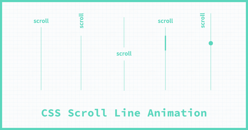
CSSだけで作成する、スクロールを促すラインアニメーションを作る方法の備忘録です。
メインビジュアルに配置されることの多い、ラインを使用したスクロールを表すアニメーションのデザインとCSSコードをまとめました。
ラインのローテーション
「scroll」の文字の下で、ラインが流れるように上から下にローテーションする定番のアニメーションです。
HTML
<div class="scroll">
  <div class="scroll-text">scroll</div>
  <div class="scroll-border"></div>
</div>HTMLでは、テキストと、ラインのアニメーションを表示する<div>をそれぞれ用意します。
CSS
.scroll {
  position: relative;
}
.scroll-text {
  color: #333;
  font-size: 14px;
  text-align: center;
}
.scroll-border {
  position: relative;
  top: 10px;
  width: 100%;
  height: 100px;
  overflow: hidden;
}
.scroll-border::before {
  content: "";
  display: block;
  position: absolute;
  width: 1px;
  height: 40px;
  top: 0;
  left: 0;
  right: 0;
  background: #333;
  animation: scrollbar 2.0s ease-in-out infinite;
  margin: auto;
}
@keyframes scrollbar {
  0% {
    height: 0;
    top: 0;
  }
  30% {
    height: 100%;
  }
  100% {
    top: 100%;
  }
}ラインは、擬似要素の::beforeに大きさと背景を設定して作成します。全体の表示位置はtop: 10px;でわずかにテキストの下になるように調整します。アニメーションで動く部分のラインは、position: absolute;を設定して位置を調整しています。margin: auto;の状態でleft: 0;とright: 0;を指定して中央に配置します。
アニメーションはanimationで、@keyframesの「scrollbar」を設定しています。heightで線の長さを、topで表示位置を変更することで上から下に伸びるラインアニメーションを繰り返し再生しています。
ラインアニメーションの表示位置を調整するposition: absolute;や、余白のコードは割愛しています。
縦向きのテキスト
ラインのアニメーションに、縦向きにしたテキストを合わせたデザインです。
HTMLのコードは、1つ目のサンプルと同じです。
CSS
.scroll {
  position: relative;
}
.scroll-text {
  color: #333;
  font-size: 14px;
  text-align: center;
  transform: rotate(90deg);
}
.scroll-border {
  position: relative;
  top: 20px;
  width: 100%;
  height: 100px;
  overflow: hidden;
}
.scroll-border::before {
  content: "";
  display: block;
  position: absolute;
  width: 1px;
  height: 40px;
  top: 0;
  left: 0;
  right: 0;
  background: #333;
  animation: scrollbar 2.0s ease-in-out infinite;
  margin: auto;
}
@keyframes scrollbar {
  0% {
    height: 0;
    top: 0;
  }
  30% {
    height: 100%;
  }
  100% {
    top: 100%;
  }
}テキストにtransform: rotate(90deg);を設定して、縦向きに変形しています。
ラインの位置は、テキストを回転させた分下になるようにtopで調整します。
ラインを重ねる
ラインを2つ重さねてグレーの線をなぞるように短い線が流れるアニメーションです。
CSS
.scroll {
  position: relative;
}
.scroll-text {
  color: #333;
  font-size: 14px;
  text-align: center;
  transform: rotate(90deg);
}
.scroll-border {
  position: relative;
  top: 20px;
  width: 1px;
  height: 100px;
  background-color: #d5d5d5;
  overflow: hidden;
  margin: auto;
}
.scroll-border::before {
  content: "";
  display: block;
  position: absolute;
  width: 1px;
  height: 30px;
  top: 0;
  left: 0;
  right: 0;
  background: #333;
  animation: scrollbar 2.0s ease-in-out infinite;
  margin: auto;
}
@keyframes scrollbar {
  0% {
    -webkit-transform: translateY(-100%);
    transform: translateY(-100%);
  }
  100% {
    -webkit-transform: translateY(350%);
    transform: translateY(350%);
  }
}ライン部分の<div>にwidth: 1px;とheight: 100px;を設定してbackground-color: #d5d5d5;のグレーの線を作成します。
擬似要素::beforeで、アニメーションで動く黒い線を作成します。@keyframesの「scrollbar」では、transform: translateY();でラインの位置を変更するアニメーションを設定しています。
テキストを下に配置
横向きのテキストを下に配置した、太さの異なる線が流れるラインアニメーションです。
CSS
.scroll {
  position: relative;
}
.scroll-text {
  color: #333;
  font-size: 14px;
  text-align: center;
  transform: rotate(90deg);
  position: absolute;
  left: 0;
  right: 0;
  bottom: -50px;
  margin: auto;
}
.scroll-border {
  position: relative;
  top: 0;
  width: 100%;
  height: 100px;
  overflow: hidden;
}
.scroll-border::before {
  content: "";
  display: block;
  position: absolute;
  width: 1px;
  height: 100%;
  top: 0;
  left: 0;
  right: 0;
  background: #333;
  margin: auto;
}
.scroll-border::after {
  content: "";
  display: block;
  position: absolute;
  width: 3px;
  height: 30px;
  top: 0;
  left: 0;
  right: 0;
  background: #333;
  animation: scrollbar 2.0s ease-in-out infinite;
  margin: auto;
}
@keyframes scrollbar {
  0% {
    -webkit-transform: translateY(-100%);
    transform: translateY(-100%);
  }
  100% {
    -webkit-transform: translateY(350%);
    transform: translateY(350%);
  }
}テキストはposition: absolute;で、表示位置を調整します。今回は、bottom: -50px;ラインの下になるように設定しています。値は、実際のデザインに合わせて調整してください。
太さの異なる線を重ねる場合は、擬似要素を2つ使用します。擬似要素::beforeには、細い方の線を設定します。擬似要素::afterには、アニメーションで動く太い線を設定します。
テキストを横並びに配置
横向きのテキストをラインの隣に配置したデザインです。アニメーションはラインの上をドットが動くタイプです。
CSS
.scroll {
  position: relative;
  display: flex;
  flex-direction: row;
  align-items: flex-start;
}
.scroll-text {
  color: #333;
  font-size: 14px;
  transform: rotate(90deg);
  padding-left: 15px;
}
.scroll-border {
  position: relative;
  position: relative;
  width: 10px;
  height: 160px;
  overflow: hidden;
}
.scroll-border::before {
  content: "";
  display: block;
  position: absolute;
  width: 1px;
  height: 100%;
  top: 0;
  left: 0;
  right: 0;
  background: #333;
  margin: auto;
}
.scroll-border::after {
  content: "";
  display: block;
  position: absolute;
  width: 7px;
  height: 7px;
  left: 0;
  right: 0;
  background: #333;
  border-radius: 50%;
  animation: scrollbar 2.0s ease-in-out infinite;
  margin: auto;
}
@keyframes scrollbar {
  0% {
    bottom: 170px;
    opacity: 0;
  }
  50% {
    opacity: 1;
  }
  100% {
    bottom: -10px;
    opacity: 0;
  }
}テキストとラインはdisplay: flex;を使用して横並びに配置しています。テキスト部分にpaddingを指定して位置を微調整しています。
ドットは擬似要素::afterにborder-radius: 50%;を設定して作成します。
アニメーションは、@keyframesの「scrollbar」でbottomの値を変更することで、ドットの位置を変更しています。さらにopacityでフェードアウトも合わせて設定しています。
中央に文字
テキストを挟んで上下に分かれたラインアニメーションです。
CSS
.scroll {
  position: relative;
}
.scroll-text {
  font-size: 14px;
  text-align: center;
  position: relative;
  top: 80px;
}
.scroll-border {
  position: relative;
  padding: 56px 0;
}
.scroll-border::before {
  content: "";
  display: block;
  position: absolute;
  width: 1px;
  height: 50px;
  top: 0;
  left: 0;
  right: 0;
  background: #333;
  animation: scrollbar-top 2.0s ease-in-out infinite;
  margin: auto;
}
.scroll-border::after {
  content: "";
  display: block;
  position: absolute;
  width: 1px;
  height: 50px;
  top: 85px;
  left: 0;
  right: 0;
  background: #333;
  animation: scrollbar-bottm 2.0s ease-in-out infinite;
  margin: auto;
}
@keyframes scrollbar-top {
  0% {
    height: 0;
  }
  30% {
    height: 50px;
  }
  90% {
    height: 50px;
  }
  90.1% {
    height: 0;
  }
  100% {
    height: 0;
  }
}
@keyframes scrollbar-bottm {
  0% {
    height: 0;
  }
  25% {
    height: 0;
  }
  55% {
    height: 50px;
  }
  90% {
    height: 50px;
  }
  90.1% {
    height: 0;
  }
  100% {
    height: 0;
  }
}
2つの擬似要素::before、::afterで上下のラインを作成し、それぞれ開始のタイミングが異なるアニメーションを設定することで、テキストを挟むように流れるラインアニメーションを実装しています。
テキストの位置はtopと、ラインのpaddingで調整します。