CSSで実装するページネーションデザインまとめ
CSSで作成したボタンにカーソルをマウスオーバーした際に、色が変わる、大きさが変わるなど様々な効果を付けるページネーションのデザインサンプルをまとめました。
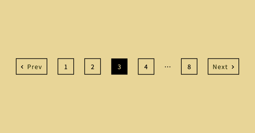
以下は、今回使用するページネーション共通のHTMLコードです。
<nav class="pagination">
  <a class="prev page-numbers" href="#">Prev</a>
  <a class="page-numbers" href="#">1</a>
  <a class="page-numbers" href="#">2</a>
  <span class="page-numbers current">3</span>
  <a class="page-numbers" href="#">4</a>
  <a class="page-numbers" href="#">5</a>
  <span class="page-numbers dots">…</span>
  <a class="page-numbers" href="#">30</a>
  <a class="next page-numbers" href="#">Next</a>
</nav>
現在表示されているページ前後の2ページ分の数字と、最後のページ数、前のページと次のページへ遷移するリンクで構成されています。
全体を構成するクラスは以下の通りです。
- pagination … ページネーション全体
- page-numbers … ページネーションを構成する数字やテキスト
- current … 現在のページ
- dots … 3点リーダー「…」
- prev … 前のページ
- next … 次のページ
該当するクラスを使用してCSSでデザインを設定していきます。
テキストの中央揃えなど一部のコードは割愛しております。余白など、デザインの細部は使用する環境に合わせて微調整してください。
シンプルなテキストと下線
テキストと下線を使用したシンプルなデザインのページネーションです。
リンク部分は、マウスオーバーで下線が引かれます。
.pagination .page-numbers {
  color: #333;
  font-size: 13px;
  text-align: center;
  text-decoration: none;
  position: relative;
  padding: 0 6px 8px;
  margin: 0 15px;
}

.pagination .current {
  border-bottom: solid 1px #333;
}

.pagination a::after {
  position: absolute;
  bottom: 0;
  left: 0;
  content: '';
  width: 0;
  height: 1px;
  background-color: #333;
  transition: .3s;
}

.pagination a:hover::after {
  width: 100%;
}currentクラスにborder-bottomで下線を設定しています。リンク部分は、擬似要素afterで下線を設定してマウスオーバーでwidthを変更することで右に伸びるエフェクトを付けています。
シンプルなテキストと四角
現在のページを四角で囲んだシンプルなデザインのページネーションです。
マウスオーバーした時も、テキストが四角い枠で囲われます。
.pagination .page-numbers {
  color: #333;
  font-size: 13px;
  text-align: center;
  text-decoration: none;
  position: relative;
  border: solid 1px transparent;
  padding: 6px 8px 5px;
  margin: 0 10px;
}

.pagination .current {
  border: solid 1px #333;
}

.pagination .prev,
.pagination .next {
    margin: 0 30px;
}

.pagination .prev::after,
.pagination .next::after {
  position: absolute;
  content: '';
  top: 0;
  bottom: 0;
  width: 1px;
  height: 30px;
  background-color: #333;
  margin: auto;
  transform: rotate(30deg);
}

.pagination .prev::after {
  right: -20px;
}

.pagination .next::after {
  left: -20px;
}

.pagination a {
  transition: .3s;
}

.pagination a:hover {
  border: solid 1px #333;
}数字とページ遷移の間の斜線は、擬似要素afterをtransformで回転させて実装しています。
四角と矢印アイコン
リンクを四角い枠で囲んだデザインのページネーションです。
左右のページ遷移にシンプルな矢印のアイコンを追加しています。
.pagination .page-numbers {
  color: #333;
  font-size: 13px;
  text-align: center;
  text-decoration: none;
  line-height: 1.2rem;
  position: relative;
  display: inline-block;
  border: solid 1px #333;
  padding: 6px 11px 5px;
  margin: 0 6px;
}

.pagination .current {
  color: #fff;
  background-color: #333;
}

.pagination .dots {
  border: none;
  margin: 0 3px;
}

.pagination .prev {
  position: relative;
  padding-left: 23px;
}

.pagination .prev::after {
  display: block;
  content: '';
  width: 5px;
  height: 5px;
  position: absolute;
  top: 0;
  bottom: 0;
  left: 10px;
  border-top: solid 1px #333;
  border-right: solid 1px #333;
  transform: rotate(225deg);
  margin: auto;
}

.pagination .next {
  position: relative;
  padding-right: 23px;
}

.pagination .next::after {
  display: block;
  content: '';
  width: 5px;
  height: 5px;
  position: absolute;
  top: 0;
  bottom: 0;
  right: 10px;
  border-top: solid 1px #333;
  border-right: solid 1px #333;
  transform: rotate(45deg);
  margin: auto;
}

.pagination a:hover {
  color: #fff;
  background-color: #333;
  transition: .3s;
}

.pagination .prev:hover::after,
.pagination .next:hover::after {
  border-top: solid 1px #fff;
  border-right: solid 1px #fff;
}左右の矢印アイコンは、borderを設定した擬似要素afterをtransformで回転させて作成しています。
シンプルなテキストと丸
現在のページに丸い背景をつけたシンプルなデザインのページネーションです。
マウスオーバーでも丸い背景が付き、テキストの色が変わります。
.pagination .page-numbers {
  color: #333;
  font-size: 13px;
  line-height: 1.2rem;
  text-align: center;
  text-decoration: none;
  position: relative;
  padding: 7px 10px 6px;
  margin: 0 10px;
  border-radius: 30px;
}

.pagination .current {
  color: #fff;
  background-color: #333;
}

.pagination a {
  transition: .3s;
}

.pagination a:hover {
  color: #fff;
  background-color: #333;
}border-radiusで角丸を設定することで、丸い波形を実装しています。
丸と矢印アイコン
現在のページと矢印アイコンを円で囲んだデザインのページネーションです。
マウスオーバーで数字に枠線が付き、両サイドのリンクは左右に移動します。
.pagination .page-numbers {
  color: #333;
  font-size: 13px;
  line-height: 1.2rem;
  text-align: center;
  text-decoration: none;
  display: inline-block;
  vertical-align: middle;
  width: 32px;
  height: 32px;
  line-height: 32px;
  border: solid 1px transparent;
  border-radius: 100%;
  margin: 0 6px;
}

.pagination .current {
  border: solid 1px #333;
}

.pagination .prev,
.pagination .next {
  position: relative;
  text-indent: 100%;
  white-space: nowrap;
  overflow: hidden;
  border: solid 1px #333;
  border-radius: 100%;
}

.pagination .prev::after,
.pagination .next::after {
  display: block;
  content: '';
  width: 5px;
  height: 5px;
  position: absolute;
  top: 0;
  bottom: 0;
  left: 0;
  right: 0;
  border-top: solid 1px #333;
  border-right: solid 1px #333;
  margin: auto;
}

.pagination .prev::after {
  transform: rotate(225deg);
}

.pagination .next::after {
  transform: rotate(45deg);
}

.pagination a:hover {
  border: solid 1px #333;
  transition: .3s;
}

.pagination .prev:hover {
  transform: translateX(-3px)
}

.pagination .next:hover {
  transform: translateX(3px)
}ページ遷移の部分はtext-indentとoverflowでテキストを消すことで、矢印アイコンのみ表示しています。
上下ライン付き
上下に罫線が付いたラインベースのデザインのページネーションです。
現在のページとリンクへのマウスオーバーで背景に色がつきます。
.pagination {
  display: flex;
  align-items: center;
  justify-content: center;
}

.pagination .page-numbers {
  color: #333;
  font-size: 13px;
  line-height: 1.2rem;
  text-align: center;
  text-decoration: none;
  position: relative;
  display: inline-block;
  border-top: solid 1px #333;
  border-bottom: solid 1px #333;
  padding: 9px 15px 7px;
  margin: 0;
}

.pagination .current {
  background-color: #efefef;
}

.pagination .prev::after,
.pagination .next::after {
  position: absolute;
  content: '';
  top: 0;
  bottom: 0;
  width: 1px;
  height: 60%;
  background-color: #333;
  margin: auto;
}

.pagination .prev::after {
  right: 0;
}

.pagination .next::after {
  left: 0;
}

.pagination a {
  transition: .3s;
}

.pagination a:hover {
  background-color: #efefef;
}
上下に線をつける際に余白を入れないように、display: flex;で要素を中央に整列させています。
角丸の枠付き
全体に角丸の枠をつけたデザインのページネーションです。
リンク部分は、マウスオーバーで下線が付きます。
.pagination {
  display: flex;
  align-items: center;
  justify-content: center;
}

.pagination .page-numbers {
  color: #333;
  font-size: 13px;
  line-height: 1.2rem;
  text-align: center;
  text-decoration: none;
  position: relative;
  display: inline-block;
  border-top: solid 1px #333;
  border-bottom: solid 1px #333;
  padding: 7px 15px 5px;
  margin: 0;
}

.pagination .page-numbers::after {
  position: absolute;
  content: '';
  bottom: 0;
  left: 0;
  right: 0;
  width: 50%;
  height: 0;
  background-color: #333;
  margin: auto;
}

.pagination .current::after {
  bottom: -1px;
  height: 2px;
}

.pagination .prev {
  border: solid 1px #333;
  padding: 7px 15px 5px 23px;
  border-radius: 30px 0 0 30px;
}

.pagination .prev::after {
  left: 7px;
}

.pagination .next {
  border: solid 1px #333;
  padding: 7px 23px 5px 15px;
  border-radius: 0 30px 30px 0;
}

.pagination .next::after {
  right: 7px;
}

.pagination a {
  position: relative;
  transition: .3s;
}

.pagination a:hover::after {
  bottom: -1px;
  height: 2px;
}マウスオーバーの下線は、擬似要素afterで実装しています。